 Pepsi vs. Coke, The Rolling Stones against The Beatles, Batman vs Superman. We constantly appear to be contrasting things to determine which is superior, whether it be drinks, artists, superheroes, vehicles, sports teams, etc.
Regarding the best practices for web design, it is the same. No matter whether or how it is consumed, every product designed and manufactured material they are producing to connect with people. To produce an overall pleasant experience. Even when hiring a product designer will also know which one to present.
But how can you tell which design strategy is superior?
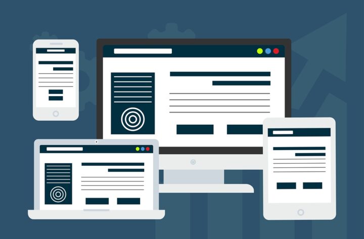
Responsive Design
Multimedia inquiries are used in responsive design, a dynamic style, to adjust the site’s format to the kind of device being used. This design is often created using a single layout and a flexible grid that adjusts naturally to the interface. A responsive design must use CSS breakpoints to scale design components.
Pros and Cons of Responsive Design
Pros
- This strategy saves money and time since designers concentrate on creating a single layout.
- Since it utilizes a unique URL for each page, it is also simpler to manage and update.
- Favorable to SEO.
- It provides a UI experience that is constant across all devices.
- Since this method is more widely used, several pre-built templates with cutting-edge capabilities are accessible on well-known CMS platforms such as Joomla and WordPress
Cons
- For the process to be optimized across all devices, programmers must write additional code.
- Because some heavy design components could upload more quickly on computers than on mobile devices, sites may take longer to load.
- To keep the visual of design components with shifting screen sizes, extensive testing is needed.
- You have less participation in the development layout across various screen sizes when using a responsive design strategy.
Adaptive Design
The adaptive design method creates layouts that are specifically suited for various devices rather than concentrating on one layout structure. The website detects the size of the interface and loads a customized layout made to fit that specific screen size.
This method calls for designers to produce the six most popular image resolutions, which are 1600 pixels by 1200 pixels, 960 pixels by 760 pixels, 480 pixels by 320 pixels, and 320 pixels by 320 pixels. However, more personalized designs may be created to match different screen sizes.
Pros and Cons of Adaptive Design
Pros
- Sometimes it’s not possible to start from scratch while redesigning an existing website. Large websites frequently use outdated code. Consequently, using an adaptable design strategy will save the have to recode your website.
- When compared to responsive sites, websites created using this method often perform 2 to 3 times better in performance testing.
- Since each style is specifically designed for particular displays, it improves the user experience throughout all devices.
- This method optimizes layouts in a categorical manner, which reduces load time.
- Design aspects are considerably more in the hands of designers.
Cons
- Since each layout needs to be produced independently, the development process takes longer and costs more money.
- Every page has several different URLs. As a result, each layout will require updating and maintenance.
- Rare screen sizes, such as exceptionally wide displays, are typically not taken into account when creating websites using this method. The website’s design format will be rendered useless if visitors view it on a device for which it was not designed.
Key Differences
| Responsive | Adaptive |
| A single layout is calibrated for several devices. | Personalizes various layouts for multiple technologies. |
| More economically as well as less time-consuming. | Procedural and labor-intensive, therefore it takes longer and costs more. |
| Slows speed of mobile downloads. | Improves the speed of loading on all devices. |
| Less flexibility over design components in various layouts. | Complete control over the design features used in various layouts. |
| Increases the effectiveness of scanning and linking. | Due to several URLs, indexing takes longer and there is less SEO impact |
| One URL each. | According to how many layouts were built, there may be several URLs for each page. |
| Ideal for Startups. | Best for trustworthy businesses with excellent websites already in place. |
| Website maintenance involves less work. | Website maintenance necessitates a lot more effort and work. |
Summary
Mobile users access websites and make purchases online using their handsets. You cannot ignore mobile traffic. To maintain a smooth and simple user experience, your website must have an adaptable or flexible design. Both of these alternatives facilitate simple website or online store navigation for your clients and visitors.
If time and money are limited and there’s no distinction between using a desktop or personal devices to read and interact with the website, experts advise building a responsive design. When loading speed is important and consumers utilize the desktop and mobile versions of a website for various reasons, adaptive design prevails.


