In 2017, Statista reported that mobile traffic contributed to 52.64% of the world’s online traffic. What this means is that if mobile website design is being looked down on, a business will lose more than half of its worldwide consumer traffic. This is a fatal business tactic, especially for startup companies.
Any business that doesn’t include a mobile website will fall behind at an alarming pace as 8 out of 10 visitors won’t engage with a website if it isn’t correctly displayed on their mobile device. And just like that, you will lose potential new customers to a rival business. What’s even worse is that Google will push down the search engine ranking of a website that isn’t responsive enough.
Of course, this doesn’t necessarily mean that desktop browsing is now obsolete, as 83% of mobile users still want to browse on their computers. Nevertheless, if a website has a responsive design, especially for mobile users, a relatively new business can truly market itself properly, especially in 2020.
Right now, there are over 3.5 billion smartphone users around the world. That number equals 45% of the overall population of the Earth. And since 2019, people have browsed the internet from over 9000 distinct devices. This means that web developers must design a website that is optimized for smaller screens. In short, websites must have a responsive design.
Best Screen Size for Mobile Website Design?
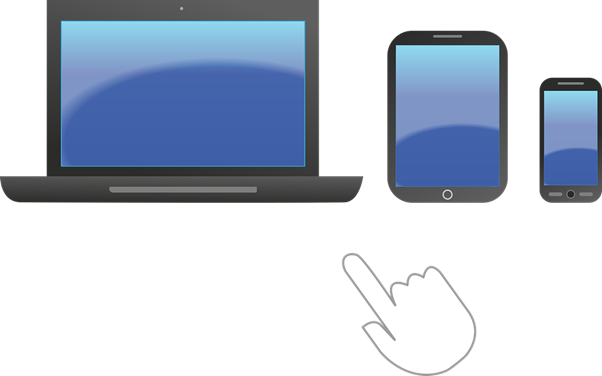
Technically, there isn’t exactly one “best mobile website design,” just as there isn’t one perfect web design in general. What is important is that a website should display itself quickly and responsively on any screen resolution, no matter the platform or browser. More importantly, a website has to be accessible and mobile-friendly. In short, you need to design what your audience likes the most. Here are some of the standard display sizes for the following devices:
- Mobile devices: 360 x 640 to 414 x 896
- Tablet devices: 601 x 962 to 1280 x 800
- Desktop devices: 1024 x 768 to 1920 x 1080
Look into Google Analytics and then optimize the screen resolution based on your target audience’s most preferred size. Remember, you don’t have to design for one particular screen resolution or monitor size as they vary among web visitors. Just ensure that the design is fast and responsive. Use a responsive or a liquid layout, that transforms the website based on a user’s screen size. Be sure to keep an eye on the Google Search Console’s usability and mobile-friendly alerts.
You need to keep the following three essential elements in mind when optimizing a web pages layout for particular screen size:
- Readability: the ease in which web text can be read in several columns according to their allocated width.
- Initial Visibility: check if the content is clearly visible over the fold so that users can view it without scrolling. It’s the kind of trade-off between the number of details that are displayed for an item against the number of items that are displayed.
- Aesthetics: check if the webpage looks neat and attractive when all the essential elements are of the right location and size for a specific screen resolution. Does every aspect of your website form up correctly – such as captions appearing right by the images?
While optimizing your website for every screen is the wisest course of action, there are several reasons why you must opt for a mobile-first approach.
Reasons Why a Mobile-First Strategy Should be Given Greater Importance
Here are some of the reasons why a Mobile-First Strategy should be given greater importance.
Available 24/7
It’s no secret that many consumers worldwide are hovering over their smartphone screens 24/7. So whenever you prefer to reach out to your audience, you can do so at any time through their phone. This is especially essential for generating traffic for your company’s mobile app.
Offers Easy Sharing Facilities
Another incredible advantage the mobile website design strategy offers businesses is allowing their customers to share any of their products and services with their friends and family members across messaging and social media platforms from their smartphones. With more customers having the advantage to share and access your app, the potential for generating a sale becomes greater as well.
Mobile Users Rule Over Desktop Users
The stats cannot be denied as there are almost 53% mobile users around the globe than desktop users. People are able to browse or surf no matter where they are on Earth instead of being restricted to one location where their desktop computers are. As such, mobile should be the first thing on your mind when trying to market your products and services to your audience.
Greater Customer Experience
The one thing that a mobile website design can provide consumers that a desktop design cannot is the ease of accessibility and responsiveness that they get on their mobile devices. Whatever your customers want, they want it right there and then and that’s exactly what your business needs to focus on.
And as you are designing your company’s mobile website, you must ensure that the site loads as quickly as the desktop version and that the navigation options are kept as minimum as possible.
Better Earning Potential
After delivering a better user experience, your audience will eventually show more interest in your business. And as soon as they convert into long-term paying customers, your mission is pretty much done. But you’ll also need to engage those consumers consistently for as long as time can tell.
Google Prefers Mobile-Friendly Websites
This is the most important reason of them all. Since Google uses a mobile crawler as the primary crawler for all new websites, there is no reason why you shouldn’t develop a mobile-friendly website for your audience.
Most Common Screen Resolutions Around the Globe
- 768×1024 – 51.98%
- 1280×800 – 7.11%
- 800×1280 – 5.34%
- 601×962 – 4.47%
- 600×1024 – 2.85%
- 1024×1366 – 1.96%
Conclusion
Now that you understand the importance of mobile website design and the types of screen resolutions that you need to focus on, we hope you now understand why your business needs a mobile-first approach.


