Companies generate huge datasets from various platforms and sources. Data visualization helps to analyze the datasets and make them easily interpretable. Visualization is part of business intelligence to help businesses and individuals dig deeper and understand data through the use of graphics, such as pie charts, pictograms, histograms, infographics, and graphs.
Visualization, to date, remains the best way to explain data, not only to professionals or business-minded people but to a layperson. Through visualization, data is quickly sourced from the datasets and transferred into imagery formats that the human brain can easily understand. When data visualization is mentioned, it’s not the enticing aesthetic value of visualization that matter but the clarity of the message it conveys.
Data visualization works in hand with analytics metrics. Hence, most data analytical tools integrate visualization features to turn the analytical metrics into charts and graphs to help businesses drive key performance indicators (KPIs) in real-time and actionable insights.
Review of The Top 5 Best Visualization Software
While many business intelligence tools support data visualization tools, there are software programs that seem to be specifically developed for visualization. Hereunder is a list of the best visualization programs for businesses and individuals/freelancers.
| Software | Price | Free Trial | Review | Website |
| Tableau | $15/month | 15 days | Read | Visit |
| Google Data Studio | Free | Free | Read | Visit |
| Canva | $119/yr | 30 days | Read | Visit |
| Sisense | Not specific | 14 days | Read | Visit |
| GoodData | Custom | Free | Read | Visit |
Verdict Summary
These visualization software applications are available as on-cloud solutions. They are accessible across platforms and can be deployed into existing business solutions. You can import data from various sources into these apps and visualize them using the best tools, such as graphs and charts.
We carefully selected these apps as the best after researching and analyzing the features of many visualization apps. The versatility of these apps is immense, with Tableau taking the lead due to its business intelligence features and decent pricing plans.
Of course, you can access data analytics tools using these software apps; you can analyze pretty different metrics factors.
How To Choose The Best Data Visualization Software
Firstly, you have to consider the features of the app(s) in comparison with the pricing. Also, look for visualization software apps that support a variety of chart and graph options for representing different data types.
Most data visualization tools are cloud-based, so they can be accessed from quite different devices. With much said already, these are the best visualization software app reviews.
List Of Data Visualization Tools To Use
1. Tableau – Best For Data Visualization With Business Intelligence
Tableau is a powerful data management, analytical, and visualization software program for big enterprises and SMEs. Freelance data managers can also use it to analyze and interpret data to help them make insights-driven decisions.
The Tableau software can connect to virtually any database, and you can create visualizations by simply dragging your datasets into the creator interface. Tableau is focused on business intelligence, and that’s why it is the go-to solution for most businesses.
Scores:
- Best For: Enterprise data visualization
- Pricing/Value: 89%
- Features: 92%
- Analytics: 95%
- Ease of Use: 94%
- Customer Service: 92%
Pros:
- So many features and tools to access
- Analyzes big data seamlessly
- Reporting with advanced tools
- There are different visualization styles to use
Cons:
- Pretty expensive
- It takes so much time to master the app’s features
Analytics
One thing to love about the Tableau software is that it comes with advanced reporting and analytical tools to analyze various metrics and provide you with deep insights into the data you have at hand. Tableau’s analytics features are among the best you’d find on any data visualization software.
User Experience
The interface is cool, easy to navigate and access the relevant tools you need to work with. However, the app itself is quite cumbersome, and you may have to spend weeks trying to familiarize yourself with the entire features and tools.
Key Features
- Multiple data connectors and visualizations tools
- Curate and share data sources
- Manage content and certify data sources
- Interact with visualizations and dashboards
- Create and receive data-driven alerts
- Edit existing workbooks and visualizations
Pricing
Tableau offers three main packages, Viewer, Explorer, and Creator, for $15, $42, and $70 per user per month.
2. Google Data Studio (Looker Studio) – Cloud-Based Data Reporting and Visualizations
Google Data Studio is a cloud-based business analytics software app that allows organizations and companies to collect and analyze data from their various business solutions. The app supports data management, exploration, transformation, and visualization.
The Google Data Studio app empowers every team member to be able to analyze and understand data, so they can answer their own questions and make data-driven suggestions. Data Studio is equally a powerful tool for digital marketers and product launchers.
Scores:
- Best For: Data analytics and reporting
- Pricing/Value: 95%
- Features: 91%
- Analytics: 95%
- Ease of Use: 94%
- Customer Service: 92%
Pros:
- You can access and customize many templates for free
- The interface is easy to navigate and use
- The interactive dashboards are really helpful
- Small teams and freelancers can access a ton of features on the free version
Cons:
- It is not as powerful as other higher-end visualization apps
Analytics
Google Data Studio has pretty advanced analytics tools to track different metrics from various data sources. The reporting/analytics interface is easy to read; virtually anyone using the app would find their way around.
User Experience
You’ve got to love the interface design of Google Data Studio. You will find the Google Data Studio very easy to use if you’ve used other Google tools, such as Analytics and Spreadsheets. More so, it loads the templates very fast, and you can customize quite different settings.
Key Features
- Over 50 templates grouped under categories
- Add your data from multiple sources
- One-click report generation
Pricing
The Google Data Studio, also called Looker Studio, is basically available for free. However, a premium version is available with the Google Workspace suite and comes with much more data tools.
3. Canva
When you talk of business applications that are very easy to use, the Canva app must be on your list. Canva is undoubtedly one of the most resourceful business tools used by modern companies, agencies, and organizations.
Canva is not only used for creating graphics and infographics; it is a powerful yet easy-to-use data visualization tool, thanks to the Graph Maker utility. Canva’s Graph Maker isn’t complicated to use; it lets you visualize your raw data instantly.
Scores:
- Best For: Graphics and Data Visualizations
- Pricing/Value: 96%
- Features: 96%
- Analytics: 90%
- Ease of Use: 95%
- Customer Service: 92%
Pros:
- There are lots of design tools that let you create stunning data visuals
- Easy to use across devices (mobile and desktop)
- Good price plans
- Intuitive, drag-and-drop interface
Cons:
- Doesn’t support powerful data analytical tools
Analytics
Data analytics is where the Canva Graph Maker app doesn’t excel so well. However, this does not mean you can’t access and analyze basic data metrics for your visualizations. Just that, if you want more powerful analytics, this isn’t the best tool for that.
User Experience
The Canva app is one of the easiest-to-use business apps – the Graph Maker tool doesn’t slack a bit on intuitiveness. Creating visualizations is easy and fast; you can import raw data from various sources and choose from 20+ visualizations styles.
Key Features
- 20+ professional graph styles to choose from
- 2,000+ professionally designed templates
- Embed your graph in presentations and reports seamlessly
- Easy drag-and-drop tools
Pricing
Canva Graph Maker has a free plan that lets you access and use basic data visualization tools. The paid plans start at $199.00 per user per year and $149.90 for five team members per year.
4. Sisense – Perfect for Data Engineers
Sisense is a BI-driven data visualization tool with quite a lot of comprehensive features and built-in tools. It is ideal for large-scale businesses dealing with tons of big data. However, the interface and multiple toolsets may seem complex to novice users.
With Sisense, you can analyze any type of data and gain deep insights by further visualizing the analyzed data. This AI-driven solution is apparently one of the best out there. It is also accessible across platforms and devices.
Scores:
- Best For: Big data visualization
- Pricing/Value: 92%
- Features: 96%
- Analytics: 95%
- Ease of Use: 90%
- Customer Service: 92%
Pros:
- In-chip processing makes it much faster
- Handles cached or live data models
- Impressive and powerful visuals
Cons:
- It looks more like the app is designed for developers and data engineers
Analytics
Sisense comes with a suite of powerful data analytical tools because it is targeted at big data companies and data engineers. The analytical and reporting tools help you dig deeper into the datasets at your disposal to uncover insights and interpret the information in the best way possible. Put simply, Sisense’s analytics is top-notch and fits into any data analytic purpose.
User Experience
The interface is a bit complex, especially if you’re not someone into data science and engineering. Notwithstanding, the learning curve is quite intuitive, so the users can easily learn how to use the features. The thing is, Sisense is meant for tech-savvy guys; non-techy guys may find it challenging to navigate the app.
Key Features
- Analytic infusion
- Pre-built industry and department-specific dashboards
- Code-free to code-first tools for deeper analysis across all skill levels.
- Seamlessly integrate into your existing tech stack and connect to all data.
Pricing
There are no particular price plans for Sisense; to get the pricing for your deployment, you need to contact the company and provide some basic information about your business.
5. GoodData – Best For Small and Medium Businesses
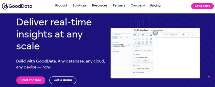
The GoodData app comes with a built-in tool called Analytical Designer. This tool helps you to analyze and visualize your data in different visualization styles to help you better understand the datasets you have in hand. It is quite fast and intuitive to use by everyone that needs a visualization tool.
With the Analytical Designer, you can also analyze facts that represent quantitative data and access interactive data visualizations that answer all questions you may have regarding data. GoodData is deployable to any business space, and its pricing plans are considerate.
Scores:
- Best For: Interactive data visualization
- Pricing/Value: 92%
- Features: 93%
- Analytics: 90%
- Ease of Use: 95%
- Customer Service: 94%
Pros:
- Practically easy to use for everyone
- Creates responsive and interactive charts and graphs for data visualization
- Easy to scale as your data needs increase
- Pricing is not user based
Cons:
- Not the easiest tool to use for someone who does not understand SQL or databases.
Analytics
GoodData is an intuitive software solution with a suite of powerful data analytical tools. The analytics gives you what you want by deeply analyzing your data to provide the insights you need. Analytical Designer has all the business data analytics tools to track various important metrics.
User Experience
The GoodData Analytical Designer is truly intuitive and easy to use. Anyone using these data visualization tools would definitely have a nice experience. Across many review platforms and websites, GoodData managed to score well above average. It’s a recommendable data visualization tool, after all.
Key Features
- Enterprise-grade security: GDPR-S, HIPAA, SOC2, GDPR, PII, ISO, and CCPA.
- Scale analytics efficiently in three dimensions
- Embed analytics into your existing systems
- Well-optimized reports and dashboards
Pricing
There is a completely free plan to start with; the plan is best for new small businesses and individuals. The paid plans have custom pricing; you have to contact the support team first to get a quote based on your needs.
Final Insights
Conclusively, these are the best data visualization tools for businesses at all levels and individuals with different skill levels. Most of them have a free plan to get started with – or offer up to 14 days of a free trial, so you can use the platform’s features and decide if you want to pay and upgrade. Tableau is the most advanced tool on this list; hence, it is ranked number one.


